.png)
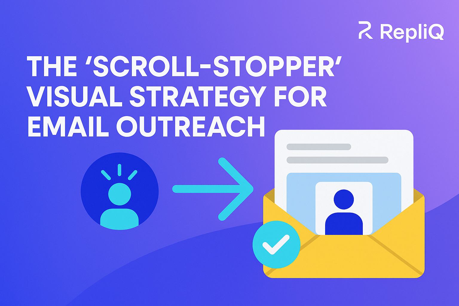
Scroll Stopper Email: A Beginner’s Guide to Visual Hooks That Increase Outreach Clicks and Replies
Most cold emails get skipped in seconds because they look like every other text-heavy message in a crowded inbox. When your prospect opens an email and sees a wall of text, their immediate instinct is to archive or delete it. But what if you could interrupt that instinct instantly?
A scroll stopper email is not about adding random images to your message—it is about using the right visual hooks to create instant relevance and curiosity. For beginner outbound marketers, SDRs, founders, and sales teams who want better engagement without needing advanced design skills, mastering visual hooks outreach is a game-changer.
In this guide, we will cover exactly what a scroll-stopper email is, why visual hooks work, which formats to use, how to match cold email visuals to specific prospect pain points, and how to test and scale the process. Through years of experience with personalized visual outreach, AI images, and tested visual triggers, RepliQ has proven that a strategic approach to visuals consistently outperforms generic templates. Once you learn the framework here, you can explore more outreach strategy resources at https://repliq.co/blog to build a fully optimized outbound engine.
What a Scroll-Stopper Email Is
If you are wondering, "what is a scroll-stopper in email outreach?", the answer is straightforward: it is an email that uses a relevant, simple visual to interrupt inbox scanning behavior and make your core message easier to understand fast.
This is vastly different from generic email outreach personalization. A true scroll stopper email possesses three core traits: absolute relevance, striking simplicity, and a clear, immediate connection to the prospect’s context or pain point. It is not about cluttered graphics, overdesigned promotional banners, or gimmicky personalization that feels fake (like a prospect's logo poorly photoshopped onto a coffee mug).
What makes a visual a true scroll-stopper
The best visual hooks outreach campaigns rely on images that are instantly understandable and tied to a meaningful observation about the prospect. The goal is faster comprehension, not decoration.
To create a pattern interrupt in email that actually works, follow this simple formula: Specific Context + Simple Visual + Clear Next Step.
When a prospect sees a visual that directly reflects their own website, workflow, or data, it immediately signals that this is not an automated blast. It proves you have done your homework and have something specific to share, increasing sales outreach engagement.
Why some outreach visuals feel helpful while others feel spammy
There is a fine line between a compelling scroll-stopper and a visual that triggers spam filters—both technically and psychologically.
Good vs. Bad Comparison:
- Good: A clean, annotated screenshot of the prospect’s pricing page highlighting a specific conversion friction point, paired with a brief note.
- Bad: A generic stock photo of a handshake or a flashy, mass-produced GIF that has nothing to do with the prospect's actual business.
Visuals feel spammy when they are too flashy, too vague, or clearly mass-produced. To avoid spammy cold email design, your personalized image outreach must be rooted in strategy. Unlike typical feature-led personalization advice that encourages users to just "add an image," a strategic cold email visuals framework ensures that every pixel serves a purpose.
Why Visual Hooks Work in Cold Outreach
To understand how do visual hooks improve cold email response rates, you have to look at modern inbox behavior. People do not read cold emails; they scan, skim, and decide in a fraction of a second whether a message deserves their attention.
Visuals act as a pattern interrupt in email because they break up the monotony of text. When a visual is relevant and tied to a promised outcome, it drives higher click intent, generates more curiosity, and significantly increases reply potential. However, relevance always beats novelty alone. According to CDC guidance on visuals that support the main message, effective visuals must reinforce the core communication rather than distract from it. This aligns perfectly with Nielsen Norman Group research on email design and scanability, which highlights that users heavily rely on scannable elements to process email content quickly.
The psychology of inbox pattern interruption
Most prospects ignoring dense text emails are doing so out of cognitive fatigue. Your outreach looks familiar, generic, and time-consuming to read. Pattern interrupt marketing examples in email show that a well-placed visual gives the prospect a reason to pause. It bypasses the need to read paragraphs of text, allowing them to understand the value proposition almost instantaneously. This immediate comprehension is the foundation of high sales outreach engagement.
Why relevance beats “creativity”
When optimizing for cold email visuals, a raw screenshot of the prospect’s site or workflow will almost always outperform a clever but generic graphic design. Visual relevance builds immediate trust. When the prospect sees their own environment reflected in the email, they know the message is about them, not a list blast.
Overdesign often reduces clarity. The best personalized cold email examples prioritize a clear message over artistic flair, proving that effective email outreach personalization is about showing the prospect you understand their world.
Best Visual Formats for Scroll-Stopper Emails
Beginners often wonder which visual format drives more replies: screenshots, GIFs, or personalized thumbnails? The answer depends on your goal and the effort you are willing to invest. Here is a practical comparison to help you choose the right format for your video prospecting email or static image campaign.
| Format | Best For | Effort Level | Risk | Ideal CTA |
|---|---|---|---|---|
| Annotated Screenshot | Showing a specific problem or missed opportunity | Low | Low (highly trusted) | "Worth fixing this week?" |
| Personalized Thumbnail | Driving clicks to a landing page or video | Medium | Low | "Recorded a quick walkthrough here." |
| GIF | Demonstrating movement, UI changes, or workflows | Medium | Medium (can feel distracting) | "Want to see how this works for you?" |
| Video Preview | Building trust, tone, and complex explanations | High | Low | "Made a 60-second video explaining this." |
By focusing on strategy, testing, and scalable AI enrichment, you can utilize these formats to close the gaps left by generic outreach tools.
Annotated screenshots
Annotated screenshots work exceptionally well when you want to highlight a specific issue, opportunity, or missed conversion point. By using simple arrows, circles, or short text labels, you can focus the prospect's attention exactly where you want it without adding visual clutter. Annotated screenshots are often the fastest, lowest-friction way to communicate, "I noticed this specifically about your business." They are a staple of effective personalized image outreach.
Personalized thumbnails
Personalized thumbnails are highly effective when your primary goal is email click-through optimization. They are useful when you want to drive a click to a landing page, a detailed video, or a personalized asset. By previewing something specific and relevant to the prospect—like their website behind a play button—you create irresistible curiosity. Keep the image clean and outcome-focused rather than overly branded. To create these assets efficiently, you can use https://repliq.co/ai-images to generate personalized thumbnails at scale.
GIFs in email outreach
GIFs in email outreach make sense when you need to quickly demonstrate movement, a workflow change, or a before/after concept. However, beginners should be cautious: do not use GIFs just because they move. The motion must actively support the message. If there is too much movement, or if you use a generic reaction GIF, it can quickly feel gimmicky, distracting, and detrimental to your visual hooks outreach.
Short video previews and video prospecting
Short video previews are ideal for a video prospecting email when trust, tone, or complex explanations matter more than a static image can convey. A personalized preview image (like a thumbnail of you pointing at their LinkedIn profile) can earn the click before the full video is even watched. Remember, your outreach strategy should decide the format, not the other way around. Cold email visuals should serve the message, not just act as a vehicle for a specific software feature.
How to Match Pain Points to the Right Visual Hook
Knowing the formats is only half the battle; you need a practical decision framework to map common outreach situations to the best visual format. If you are struggling with low reply rates from generic outreach, skipped text emails, or limited design resources, use this framework to match your prospect's scenario to the right visual hook.
If the prospect is ignoring generic text emails
When prospects ignoring dense text emails are your main hurdle, use simple screenshots or personalized thumbnails that instantly show relevance. These visuals help the reader understand the core point before they even read the full message. Pair this scroll stopper email tactic with a low-friction CTA like, “Worth a quick look?” to maximize email click-through optimization.
If you need to show a problem fast
If your goal is surfacing a missed opportunity, a broken user flow, or a conversion friction point, annotated screenshots are your best tool. Keep one clear message per visual to reduce confusion and increase clarity. According to the CDC guide to choosing and testing effective visuals, keeping visuals simple, audience-centered, and focused on a single idea is critical for fast comprehension in email outreach personalization.
If you want curiosity and clicks
When your primary goal is email click-through optimization, personalized thumbnails or video previews are unmatched. These formats work best when the image implies that useful, highly relevant value awaits on the next page. Use a video prospecting email approach with CTA styles like, “Recorded this for you,” or “Made a quick mockup of your new landing page.”
If you’re worried about looking gimmicky
For those with no design skills for outreach visuals who fear looking spammy, the rule is simple: emphasize real context and visual restraint. Avoid over-personalization that feels forced or fake. Follow this mini-checklist for best practices for scroll-stopper email design:
- No stock photo feel.
- No visual clutter.
- No irrelevant novelty.
Best Practices for Scroll-Stopper Email Design
Executing visual hooks outreach requires tactical discipline. Focusing on clarity, lightweight visuals, readability, and accessibility will help beginners avoid common pitfalls and maintain high deliverability.
Keep visuals simple and message-first
Always recommend one key idea per visual. Busy layouts, excessive text inside the image, and unnecessary company branding dilute the impact of a scroll stopper email. The cold email visuals should support the email’s written promise, not compete with it. If it takes more than three seconds to understand the image, it is too complex.
Design for accessibility and blocked-image scenarios
Not all email clients load images by default. Therefore, your email outreach personalization must still make sense even if the image is blocked. Always include descriptive alt text and ensure the surrounding copy explains the point of the image. Clickable visuals should still be understandable with text support. Follow the W3C guidance on image alt text and utilize the W3C decision tree for image text alternatives to ensure your personalized image outreach remains accessible and effective in all inbox environments.
Common mistakes that reduce replies
To avoid spammy cold email design, steer clear of these common mistakes:
- Irrelevant visuals: Images that do not tie directly to the prospect's pain point.
- Too much motion: Distracting GIFs that pull attention away from the CTA.
- Too many elements: Cluttered images that confuse the eye.
- Weak alignment: An image that promises one thing while the text discusses another.
Before vs. After Example:
- Before: A screenshot of a prospect's entire homepage with five different red circles, a large logo, and a paragraph of text overlaid on the image.
- After: A cropped screenshot of just the prospect's specific broken CTA button, with a single red arrow pointing to it.
Simplicity breeds trust and clarity, driving higher sales outreach engagement.
How to Test and Scale Visual Personalization
Moving from one-off creative ideas to a repeatable outreach process requires structured testing. If you want to know how do you test visual triggers in outreach campaigns, you must focus on practical workflows rather than just tool features.
What to measure first
When evaluating cold email visuals, focus on three primary metrics:
- Click-Through Rate (CTR): The percentage of people who clicked your image or link. This is often the fastest and most reliable signal when testing thumbnails for email click-through optimization.
- Reply Rate: The percentage of people who responded to your email.
- Meetings Booked: The ultimate indicator of sales outreach engagement and campaign success.
Depending on your campaign goal, determine which metric matters most before you begin testing.
A simple beginner testing workflow
To learn how to test visual triggers in outreach campaigns effectively, start with one audience segment and one visual variable. Do not change the subject line, body copy, and image all at once.
- Test an annotated screenshot versus a personalized thumbnail.
- Once you find a winner, refine the CTA or the depth of personalization.
- Document the results rigorously so your team can build repeatable patterns for your scroll stopper email campaigns.
Scaling without losing relevance
The ultimate goal of email outreach personalization is not infinite customization, but efficient relevance. To learn how to personalize visuals at scale in cold email, rely on templates, repeatable prompts, and AI-assisted workflows.
RepliQ serves as the operational layer that helps teams create personalized image and video outreach effortlessly. By integrating https://repliq.co/ai-images into your workflow, you can automate scalable visual personalization without sacrificing the 1-on-1 feel. This modern workflow eliminates the bottleneck of manual, design-heavy approaches. For more tactics on testing and scaling, check out https://repliq.co/blog.
Expert Insights and Strategic Takeaways
The winning approach to a scroll stopper email is not simply to "use more visuals." It is to "use the right visual for the right reason."
Screenshots, thumbnails, GIFs, and video previews each have entirely different jobs in your visual hooks outreach. An annotated screenshot proves you did your research; a personalized thumbnail drives a click; a GIF shows a transformation. Adopting a strategy-first mindset before choosing any tool or format is what separates top-performing outbound teams from the rest. RepliQ’s positioning around tested visual triggers ensures that your personalized visual outreach earns genuine attention without ever feeling gimmicky or forced.
Conclusion
A scroll-stopper email works because it leverages visuals that are relevant, simple, and directly connected to the prospect’s world. By understanding the prospect's pain point, choosing the right visual format, keeping the design lightweight, and systematically testing performance metrics like CTR, reply rate, and meetings booked, you can dramatically improve your outbound results.
Strong visual hooks outreach does not require advanced design skills; it requires strategic empathy and the right execution framework. Ready to transform your cold emails from ignored text blocks into high-converting visual experiences? Explore RepliQ’s AI image capabilities and broader outreach education to start scaling your personalized image outreach today.
FAQ
What is a scroll-stopper in email outreach?
A scroll-stopper email uses a highly relevant, simple visual to interrupt a prospect's inbox scanning behavior. It is designed to facilitate faster understanding of your core message and create instant relevance, rather than just adding decorative images to an email.
How do visual hooks improve cold email response rates?
Relevant visuals increase prospect attention, message clarity, and click intent by tying directly to a real context or pain point. While outcomes depend on execution and audience fit, visual hooks outreach consistently outperforms text-only emails by reducing cognitive load and proving immediate relevance.
Should I use GIFs or static images in sales emails?
Choose based on your use case. Use static images (like annotated screenshots) for maximum clarity and quick relevance. Use GIFs only when you need to show movement, such as a process change or UI workflow. The core message should always determine the format.
What kinds of images work best in outreach emails?
Annotated screenshots, personalized thumbnails, and simple preview visuals that connect directly to a prospect's pain point or desired outcome work best. Avoid decorative cold email visuals or generic stock photos that offer no clear reason to exist in the message.
How personalized should visuals be in cold email?
Your email outreach personalization should be specific enough to feel highly relevant to the individual prospect, but simple enough to scale across campaigns. Personalize around one clear prospect insight instead of over-customizing every element of the image.

.svg)
.png)


.svg)


