.png)
How to Use RepliQ for UX Personalization Outreach: Turn Website Analysis Into Higher-Reply Prospecting
Most outbound teams already know that generic personalization underperforms. Yet, many still stop at surface-level research, relying on first-name variables or automated company mentions to carry their campaigns. The real opportunity lies in using visible website UX issues to make your outreach feel timely, specific, and commercially relevant.
This article will show you how to move from basic website analysis to a clear, compelling outreach angle. We will cover how to package these insights with annotated screenshots or short personalized assets inside a repeatable workflow. This is not basic cold email advice; it is an advanced process for combining conversion rate optimization (CRO) thinking, UX signals, and outbound execution.
As a leader in generating personalized screenshots and video-based outreach assets, RepliQ provides practical, repeatable workflows rather than vague personalization claims. For more outbound and personalization playbooks, explore the RepliQ blog.
Table of Contents
- Why UX signals make outreach more relevant
- Which website issues are worth mentioning first
- A repeatable workflow from site analysis to outreach message
- Screenshots vs personalized videos in prospecting
- How to scale UX-based personalization without losing credibility
- FAQ
Why UX Signals Make Outreach More Relevant
Website UX observations create stronger outreach hooks than generic personalization because they connect directly to visible friction and probable conversion loss. When you identify a specific UX issue on a prospect's site, you have a concrete reason to reach out. This is vastly superior to sending a broad, easily ignored “we help improve conversions” pitch.
The goal here is not to critique design subjectively. Instead, it is to point out user-friction signals that may affect business outcomes. This approach perfectly aligns with the needs of outbound teams, growth leaders, and agencies who require sharper relevance at scale.
Unlike generic prospect research and media-first outreach tools that merely deliver messages without generating insights, UX personalization outreach bridges the gap between observation and action. According to the NIST usability testing framework, usability is defined by effectiveness, efficiency, satisfaction, and task completion. Similarly, Digital.gov usability guidance reinforces that usability should be framed around whether users can accomplish goals easily, rather than subjective visual preferences.
Why Visible Website Friction Beats Generic Personalization
Visible friction creates immediate relevance because the prospect can verify it in seconds. When a prospect can see exactly what you are talking about, it drastically reduces the “spam” feeling often associated with generic lines about growth, optimization, or user experience.
In cold email personalization, one concrete, verifiable issue often outperforms five weak personalization tokens. By tying your outreach angle to a visible website analysis, you directly impact reply quality, meeting likelihood, and the overall success of conversion conversations. User experience signals are undeniable proof that you have actually looked at their business.
The Business Case for UX-Based Outreach
To make this strategy work, you must translate UX issues into simple business hypotheses: lost clicks, lower form completion, weaker trust, or reduced mobile conversions. You are not promising a full, exhaustive audit in the first touch. You are simply surfacing one likely friction point worth discussing.
This is a smarter form of personalized outreach because it links observation to direct business impact. Recent research on personalized persuasion supports the broader value of tailored messaging, proving that tying CRO outreach to specific, tailored observations yields higher engagement than generalized value propositions.
Which Website Issues Are Worth Mentioning First
Not all website UX issues are created equal. To succeed, you must prioritize the specific issues most worth turning into outreach hooks. The core rule is simple: choose one high-visibility, high-impact issue that is easy to explain and credible in a short message.
This is an exercise in prioritization, not a comprehensive list of UX flaws. The best issues are obvious enough to mention quickly and meaningful enough to suggest a real business impact. Following established issue severity prioritization guidance, you should choose issues based on their impact, friction level, and task interference.
High-Impact Issues That Make Strong Outreach Hooks
Certain landing page usability issues consistently make the best hooks because they are visible, understandable, and tied to conversion behavior. Focus on these categories:
- Unclear value proposition above the fold: "I noticed the main headline on your homepage doesn't immediately state who the product is for, which might cause early bounces."
- Weak call to action: "The 'Submit' button blends into the background, potentially causing you to lose clicks from interested buyers."
- Missing trust signals: "I didn't see any customer logos or testimonials on the pricing page, which can sometimes slow down purchasing decisions."
- Cluttered layouts and poor hierarchy: Important information is buried.
- Poor mobile usability: Buttons are too small to tap on a smartphone.
- Slow-loading pages: Assets take too long to render, causing drop-offs.
- High-friction forms: Too many required fields before a user can book a demo.
A Simple Prioritization Framework for Outbound Teams
To streamline your website analysis and website audit processes, use this simple decision model:
- Visibility: Can the prospect see it immediately?
- Business Impact: Does it likely affect conversion optimization?
- Specificity: Can you explain it in one or two lines?
- Confidence: Can a human reviewer validate it quickly?
Avoid low-confidence or overly technical observations in first-touch outreach. The strongest angle is usually the issue that is easiest for the prospect to recognize and hardest for them to dismiss.
Issues to Avoid or Handle Carefully
When executing prospecting automation, avoid making sweeping claims from limited observation. Do not attempt to diagnose analytics-level problems that are not externally visible (e.g., "Your bounce rate must be 80%").
Subjective design criticism, inaccessible jargon, or overreaching CRO claims will rapidly reduce trust. Always ensure human review before sending AI-assisted findings. Credible outreach is based on observed, evidence-based claims rather than speculative teardown language.
A Repeatable Workflow From Site Analysis to Outreach Message
To differentiate from generic cold email personalization, you need a structured, operational workflow. RepliQ acts as the bridge between UX insight and outreach asset creation, ensuring the process is fast enough for outbound teams and structured enough to scale. Here is how to personalize outreach using website UX issues effectively.
Step 1 — Analyze the Prospect’s Website for Conversion Friction
Begin your website analysis by reviewing the homepage, landing page, CTA path, form, and mobile experience for visible friction. To avoid analysis overload, focus on one page and one issue first.
Document the website UX issues in simple terms: what is happening, why it matters, and what the user likely experiences. While AI-assisted analysis can speed up website audit issue detection, a human must always validate the final observation to ensure compliance and accuracy.
Step 2 — Turn the UX Observation Into a Business-Impact Hypothesis
Next, convert the raw finding into outbound messaging. Instead of saying "this CTA is buried," frame it as a business problem: "users may not know the next step, which could reduce conversions."
Use careful hypothesis language: likely, may, could, appears to. Emphasize that the message should connect user experience signals to tangible outcomes like trust, clarity, form completion, or demo requests. This grounds your conversion optimization claims in reality.
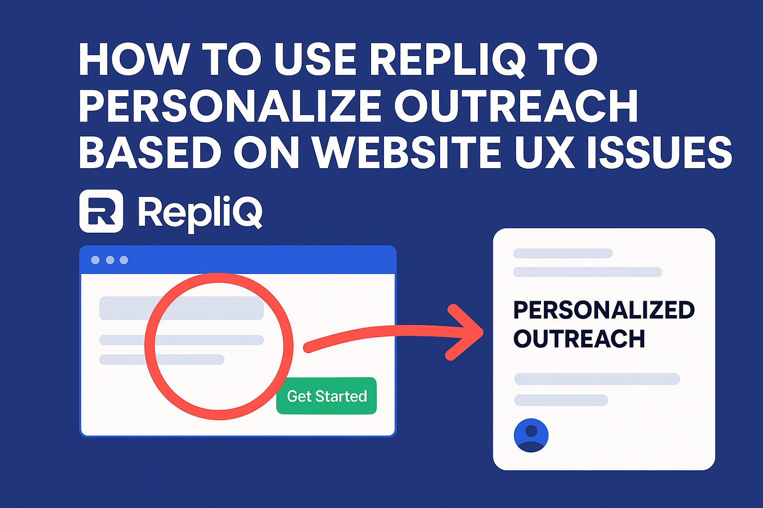
Step 3 — Capture Visual Proof With RepliQ
Observations require proof. Annotated screenshots or short personalized assets make your observation concrete and believable. Visual proof reduces vagueness and helps the prospect see the issue instantly.
RepliQ is the premier workflow tool for turning these website analysis observations into personalized outreach assets at scale. For example, an annotated screenshot might feature a subtle red box highlighting a missing trust badge on a checkout page. For a deeper dive into this workflow, explore how to use ChatGPT and RepliQ for screenshots. RepliQ’s practical experience in generating these assets provides a vital credibility layer for outbound teams.
Step 4 — Write the Outreach Message Around One Insight
Keep your CRO outreach brief and specific. Avoid long teardown copy. Use this simple outreach formula for cold email personalization:
- Observation
- Likely impact
- Visual proof
- Low-pressure CTA
Example 1 (Weak CTA): "Hi [Name], I was browsing your pricing page and noticed the 'Get Started' button is a bit hard to find on mobile. This might be costing you mobile signups. I made a quick screenshot showing what I mean—open to seeing it?"
Example 2 (Missing Trust): "Noticed your trial signup lacks customer logos. Adding them could likely boost your form completion rate."
Always sound consultative, never accusatory.
Step 5 — Review for Accuracy Before Sending
Before any prospecting automation fires, implement a quality-control step. A rep must check whether the issue is still live, clearly visible, and fairly described.
This prevents false positives and protects your brand's credibility. If the prospect could easily dispute the claim, remove it. AI assistance should support your website analysis speed, not replace human judgment.
Mini Templates for Different Prospect Segments
Keep examples compact so they are easy to adapt into sequences based on website UX issues:
- SaaS: "Hi [Name], I noticed your homepage hero section doesn't clarify if the tool is for enterprise or SMBs. This could be increasing your early bounce rate. I grabbed a quick screenshot highlighting the copy—worth a chat?"
- Agencies: "Hi [Name], your portfolio page looks great, but the lack of a clear 'Contact Us' CTA at the bottom of case studies might be causing drop-offs. Open to a quick idea on fixing this?"
- Ecommerce Brands: "Hi [Name], I was looking at your product pages and noticed the mobile 'Add to Cart' button requires scrolling. This friction likely impacts mobile conversions. I made a short visual of the flow—want to see it?"
Screenshots vs Personalized Videos in Prospecting
Deciding between annotated screenshots and short personalized videos depends on the issue type, buyer context, and speed-to-send. Both formats are powerful for personalized outreach, but applying them correctly is key to leveraging website analysis efficiently.
When Screenshots Work Best
Screenshots are ideal when the issue is immediately visible: weak CTA hierarchy, clutter, missing trust signals, or confusing above-the-fold messaging.
Annotated screenshots are faster to produce, easier to scan, and highly effective for first-touch relevance. Use annotations sparingly—a simple box or arrow—so the asset remains clear, credible, and focused on landing page UX.
When Personalized Videos Work Best
Personalized video is better when context matters or when the user experience signals span multiple elements, such as a mobile navigation flow or a confusing signup path.
A short walkthrough can explain flow-based friction more naturally than static visuals. However, avoid overproduced or overly long videos in outbound cold email personalization; keep them under 60 seconds.
A Practical Decision Rule for Teams
Use this simple framework for manual vs ai-assisted outreach personalization:
- Use screenshots for obvious, single-point issues.
- Use video for flow-based or multi-step friction.
- Default to the fastest format that preserves clarity.
Test format choices by segment and outreach stage. Ultimately, the real differentiator is the quality of the website analysis insight behind the media. While generic video-first tools help you record content, RepliQ helps you structure the actual insight-to-message process.
How to Scale UX-Based Personalization Without Losing Credibility
The biggest challenge for advanced readers is making this process repeatable across larger prospect lists without becoming shallow or error-prone. Scale comes from systematizing issue selection and message frameworks, not from automating unverified claims.
Combine AI-Assisted Analysis With Human Review
AI website analysis for personalized sales outreach can rapidly speed up the first-pass review, categorize issue types, and suggest messaging angles. However, human review remains essential for verification, tone, and confidence. This hybrid model is the best answer to the scale-vs-quality problem in prospecting automation.
Build an Issue Library and Messaging Framework
Turn cold email personalization into a standardized team workflow by creating an issue library. Standardize categories for recurring issues: weak CTA, missing trust, clutter, mobile friction, slow pages, and form friction.
Pair each website audit checklist item with:
- Validation criteria
- Business-impact hypothesis
- Screenshot/video guidance
- 1–2 outreach opener templates
Protect Credibility With Clear QA Rules
To maintain trust as volume increases, enforce strict QA rules for your personalized outreach:
- Never mention more than one primary issue in the first touch.
- Avoid unverifiable claims.
- Use hypothesis language (e.g., "might," "could").
- Review screenshots for clarity.
- Refresh assets if the prospect's page changes.
Credible conversion optimization outreach is based strictly on observed evidence, not automated speculation.
Measure What Actually Matters
Do not just track open rates. Track quality-focused outcomes:
- Reply rate
- Positive reply rate
- Meetings booked
- Conversation quality
- Issue-to-response patterns by segment
Learn which UX issues generate actual interest, and tie measurement back to the optimization of your CRO outreach and asset formats.
Where RepliQ Fits in the Scalable Workflow
RepliQ serves as the operational bridge between insight discovery and personalized outreach delivery. It provides stronger workflow specificity, clear visual proof, repeatable personalization, and a better connection between UX observation and outbound execution. To explore more advanced outbound tactics, visit the RepliQ blog.
Future Trends in UX-Led Outreach
As signal-based outbound prospecting evolves, advanced teams are integrating AI-assisted website analysis with multimodal outreach using screenshots, GIFs, and short videos.
Future differentiation will come from better signal quality and workflow orchestration, not just injecting more personalization tokens. The strongest teams will combine deep buyer research with real-time website observations, ensuring all data extraction and analysis remain fully compliant with public data use policies.
Conclusion
Better personalization comes from observable UX friction, not generic prospect facts. By identifying one meaningful website issue, validating it, connecting it to a likely conversion impact, and presenting it with clear visual proof, you elevate your outreach from spam to consultative value.
Remember that screenshots and videos are only effective when the underlying website analysis is relevant and credible. Start using RepliQ today to turn your UX personalization outreach into repeatable, high-relevance assets that actually book meetings.
FAQ
How can website UX issues improve outreach personalization?
Website UX issues make personalized outreach more relevant because they give your message a visible, specific context. Instead of generic praise, you are highlighting a verifiable point of user friction tied to a likely business impact.
What website analysis signals are best for cold outreach?
Focus on high-visibility signals during your website analysis. The best issues for cold email personalization include weak CTAs, missing trust signals, unclear messaging, layout clutter, mobile friction, and slow-loading pages.
How do you personalize outreach using landing page UX problems?
To learn how to personalize outreach using website ux issues, follow a short method: identify one specific landing page usability issue, explain its likely effect on conversions, add a screenshot or short asset as proof, and keep the call-to-action low pressure.
How can AI tools analyze websites for personalized sales outreach without creating false positives?
The safest method is a hybrid approach. Use AI website analysis for personalized sales outreach to accelerate issue detection and categorization. Then, apply mandatory human review to validate the findings before any prospecting automation sends the message.
Should outbound teams use screenshots or videos for UX-based outreach?
Follow a simple rule for personalized outreach: use annotated screenshots for clear, single-point issues (like a missing button), and use personalized video for context-heavy or flow-based friction (like a confusing multi-step checkout process).

.svg)
.png)


.svg)


